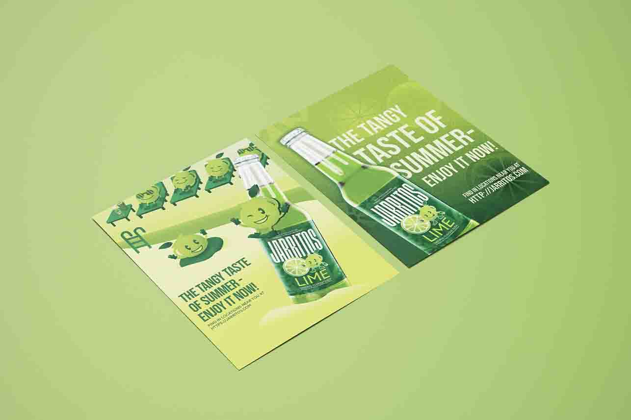
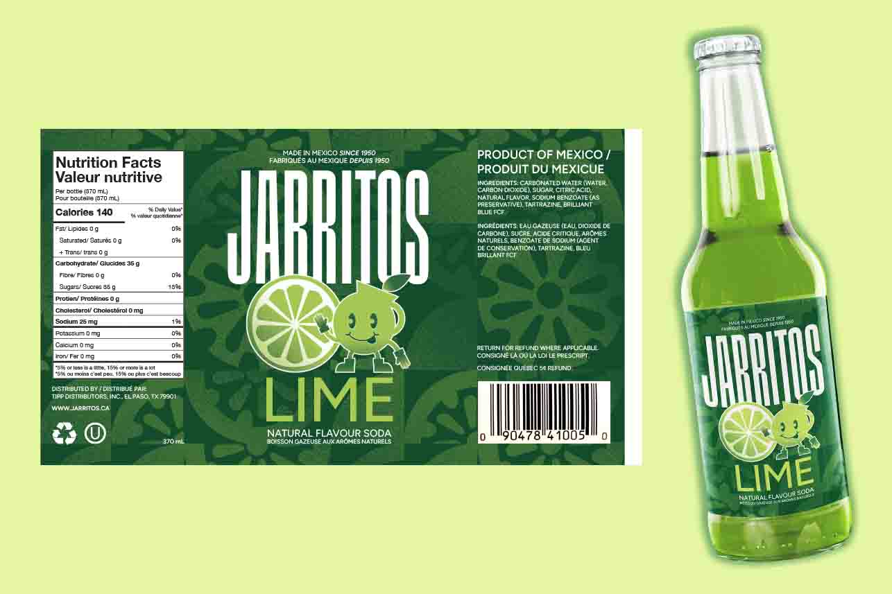
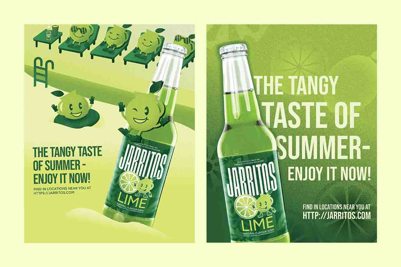
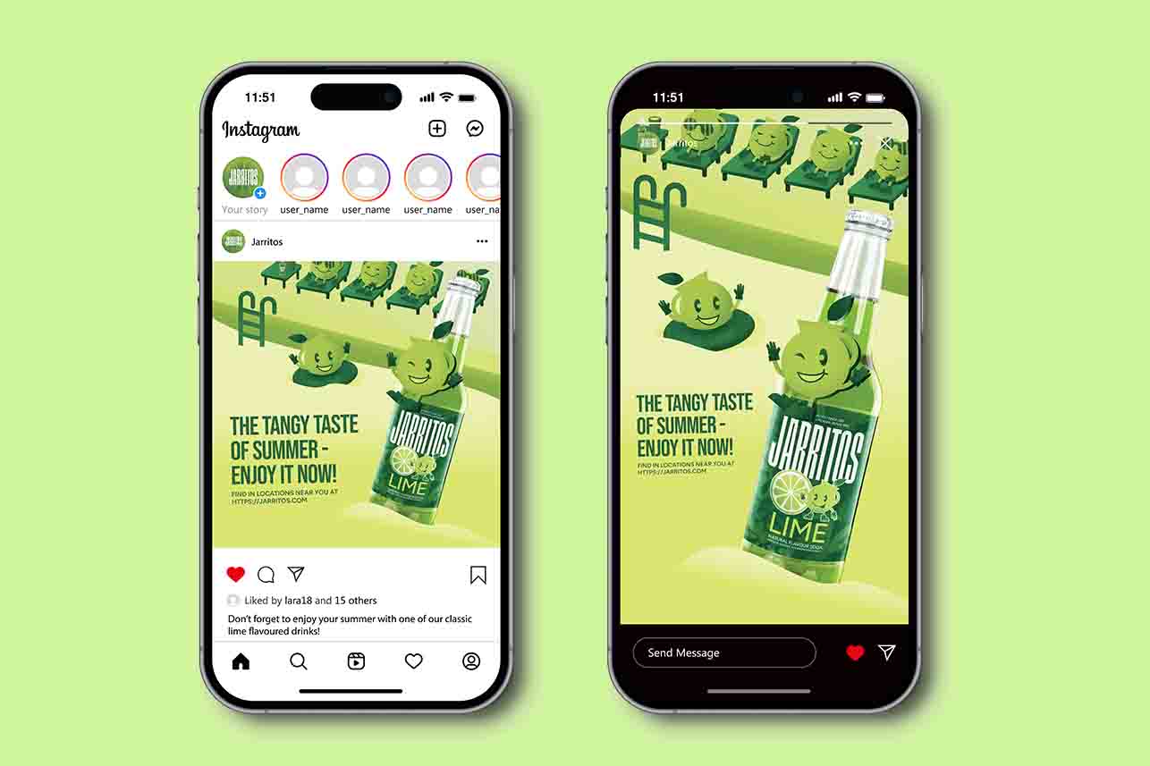
JARRITOS REBRAND PROJECT
The goal was to give Jarritos’ existing drink label and develop advertisements from it. Since “Jarritos” translates to “little jug” in Spanish, the new design features a fun, illustrative mascot, conveying a fun and approachable tone. To highlight the brand’s wide range of flavours, each design uses a bold, monochromatic colour scheme. Two print posters were created based on this concept, and one was resized to fit both Instagram posts and story formats.